About subgrid and colored grid lines
- Published:
- Last edit:
- Reading time:
- 16 min.
For me, subgrid is the missing piece for my mental model to fully embrace grid.
With CSS grid, row and column tracks created in a parent grid can only be used to position direct children of the grid container. Subgrid allows sharing all that with nested grids.
Instead of defining the line names and track sizing functions explicitly, we use the keyword subgrid as the value for grid-template-columns or grid-template-rows to inherit the grid track from the nearest ancestor grid.
For example, a classic 12 column grid can be created once for the whole page, and we can then lay out our items in there, no matter how deeply they are nested in the DOM. You can see the current Browser support for CSS Subgrid on caniuse.com.
Preparing the stage
For a project, I will turn a design into code that seems to be made for subgrid: The page is divided into four columns, within a wrapper. The four columns are visibly divided by 1px wide vertical lines that run from the top of the page to the bottom. All elements and content are directly aligned to these lines, some content is spread over several columns, others only start at a certain grid line.
Setting up the HTML
I set up the following HTML for testing:
<body>
  <div class="wrapper">
    <header class="landmark">
      <h1>Biscuit!</h1>
      <svg><!-- ... --></svg>
    </header>
    <main class="landmark">
      <article class="chocolate">
        <h2>Chocolate cake</h2>
        <p>Cookie tart cake cotton candy chocolate chocolate.</p>
        <section>
          <h3>Jelly beans</h3>
          <p>
            Jelly beans gummi bears halvah halvah croissant lemon drops donut gummi bears
            candy canes. Icing sugar plum chupa chups jelly-o soufflé jelly-o pudding
            lollipop. Chocolate bar muffin bonbon pie tootsie roll danish bear claw
            cheesecake.
          </p>
        </section>
        <section>
          <h3>Cheesecake</h3>
          <p>Powder halvah soufflé caramels soufflé chocolate cake halvah.</p>
        </section>
        <section>
          <!-- ... -->
        </section>
        <section>
          <!-- ... -->
        </section>
      </article>
    </main>
    <footer class="landmark">
      <p>
        Diving into subgrid. Created and maintained by
        <a href="#">Lene</a>
      </p>
      <nav>
        <ul role="list">
          <li>
            <a href="#">RSS Feed</a>
          </li>
          <li>
            <a href="#">Follow</a>
          </li>
        </ul>
      </nav>
      <p>Crafted with semantic HTML.</p>
    </footer>
  </div>
</body>Defining the “parent” grid
First, I set the dimensions for the wrapper.
.wrapper {
  inline-size: clamp(16rem, 93vw, 120rem);
  margin-inline: auto;
  position: relative;
}
This wrapper is to accommodate my page-wide grid system. However, I want to leave my wrapper class untouched, it should only take care of the concern that its name implies.
My <body> element has one direct child, namely my wrapper. I use this selector to define the grid system separately (a new class with a corresponding name would also be an option).
body > div {
  display: grid;
  grid-template-columns: repeat(4, 1fr);
}
Now the wrapper <div> is divided into four equally sized columns, placed directly adjacent to each other without any space between them (If you’re reading this on your phone, the columns aren’t equally sized because the elements with their different sizes make themselves space in there).
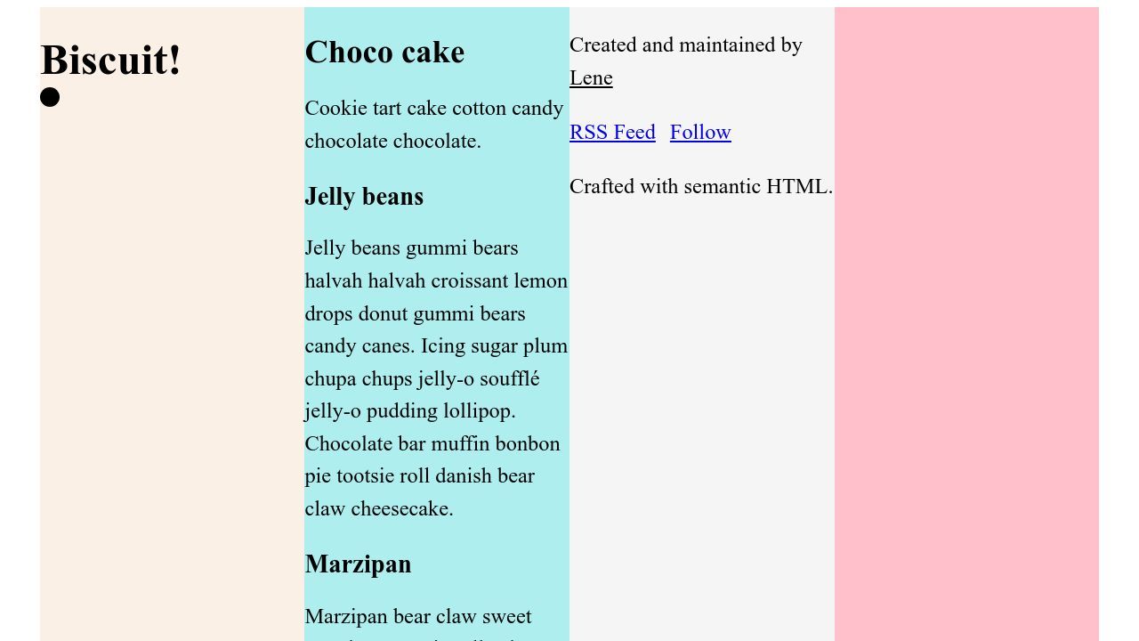
The wrapper has three children, and these are now placed in the first three columns. This is their natural behavior, because they are children of a grid, and they divide themselves into the available tracks.
Activating subgrid
The magic of subgrid is that the element “inherits” a superior grid track for its own children.
Let’s activate subgrid!
:is(header, main, footer).landmark {
  display: grid;
  grid-template-columns: subgrid;
}
This is not working yet. I can see in the dev tools that subgrid is active, but all three are still stuck in a column.

That’s because they still act as items of their parents grid system, and thus place themselves in the first available column.
Instead, I want them to occupy the entire width of the wrapper and therefore specify which columns of their grid parent they should occupy:
:is(header, main, footer).landmark {
  display: grid;
  grid-template-columns: subgrid;
  grid-column: 1 / -1;
}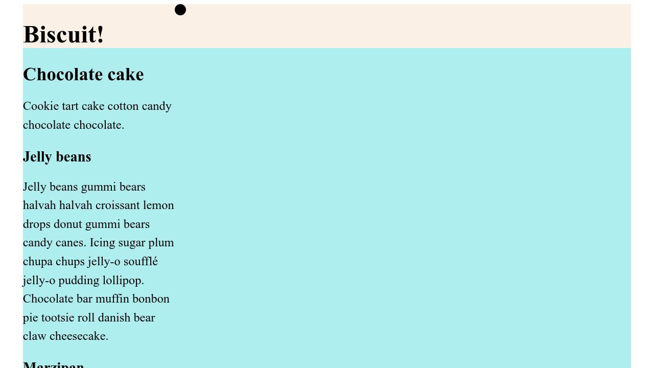
Now our three landmarks take over the ancestor grid and place their own children in it! That goes for <header> and <footer> at least - <main> extends across all columns, but still only sorts its items into the first column. We’ll come to that in a moment.
Also, three rows have been created intrinsically.
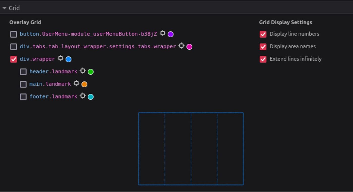
It is worth taking a close look at the dev tools for grid: Firefox shows an indentation when the page contains a grid with a subgrid.
Placing items in the grid
Again, by default, the child elements of the landmarks are placed next to the first available grid line.
header
I don’t have to worry about the anchor element in the <header> for now.
But according to the design, the SVG should align with the fourth grid line. I achieve this by generally aligning it to the last column line:
header.landmark svg {
  grid-column-start: -1;
}
main
While <main> is a subgrid, its child <article> is not: the default flow environment is in place. For some reason I had the feeling that I should use subgrid-values sparingly. But I haven’t really found a reason for that. So I turn all <article> elements that are direct children of <main> into subgrids as well:
main.landmark > article {
  display: grid;
  grid-template-columns: subgrid;
  grid-column: 1 / -1;
}Looking at the design, the <article>'s title and paragraph should not be placed in the normal grid flow, but each occupy its own row within the first column.
I make the paragraph take up its own row within the same column.
main.landmark > article > p {
  grid-row: 2;
}
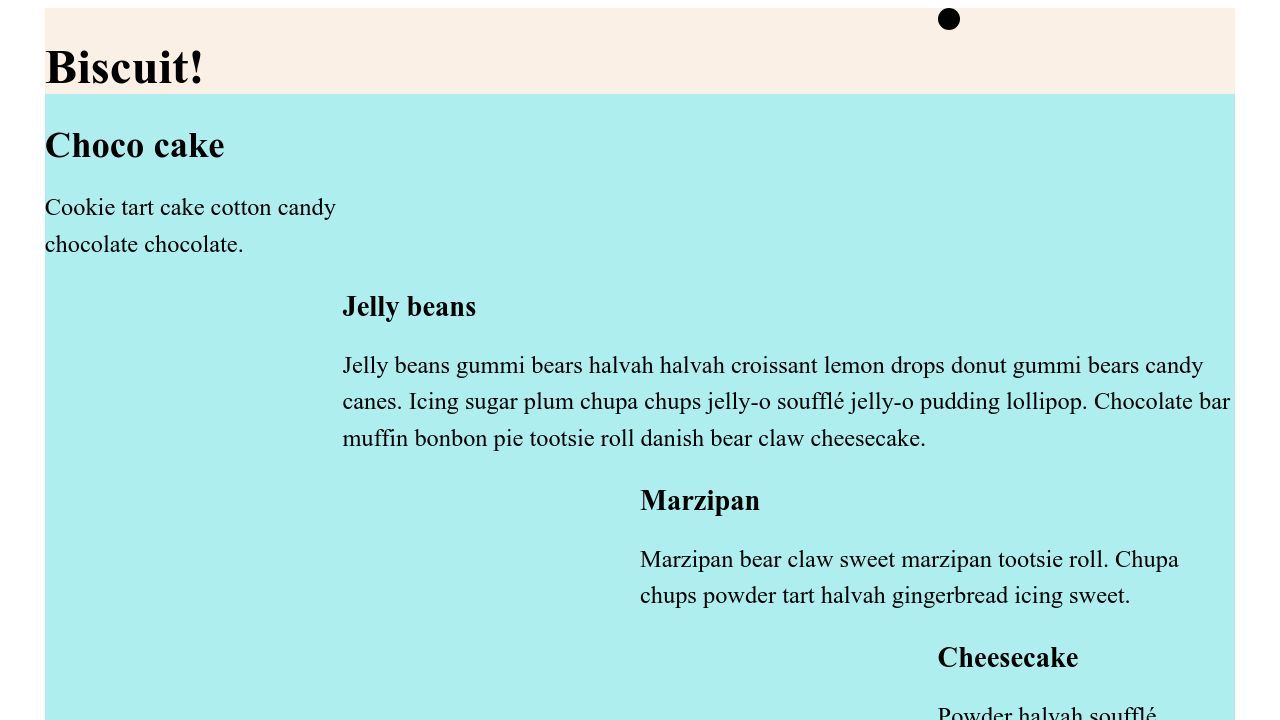
The sections in <main> are distributed across different columns in the desktop design.
I now place them explicitly in the row and column assigned to them. In our example, there are only sections within main.landmark, but considering future compatibility, <main> will accommodate further <article> elements in a more extended HTML, so I will be more explicit wit my selectors.
article.work > section:first-of-type {
  grid-column: 2 / -1;
  grid-row: 3;
}

article.work > section:nth-of-type(2) {
  grid-column: 3 / -1;
  grid-row: 4;
}

article.work > section:nth-of-type(3) {
  grid-column: span 1 / -1;
  grid-row: 5;
}

article.work > section:last-of-type {
  grid-column: 3 / -1;
  grid-row: 6;
}
footer
I also want to place elements in their own row in the <footer>. I can define this extra row directly in the landmark.
In addition to the subgrid defined above, it now gets its own grid-template-rows value.
The first child element is supposed to stretch over two columns and rows, the menu and the last pragraph will be aligned one below the other on the right.
footer.landmark {
  grid-template-rows: repeat(2, auto);
}

footer.landmark p:first-of-type {
  grid-column: span 2;
  grid-row: 1 / -1;
}

footer.landmark p:last-of-type,
footer.landmark nav {
  grid-column: span 2 / -1;
  place-self: end;
}
repeat(2, auto) means there will be two rows in the grid, and both should have the same height, dynamically determined based on their content.auto indicates that the height of the rows will adjust automatically to fit their content.
Colored grid lines
Our elements are aligned, let’s move on to the part that sounds simple at first: the columns of our layout should be marked by colored dividing lines. Can’t I just color grid lines?
My original idea actually was, to somehow add a color to the column grid lines on the wrapper in the background.
That doesn’t work. I can display the lines in the dev tools, but I don’t seem to have a way to actually address these lines with a color, using CSS.
However, I have found some approaches in the wild (In other words: Stack Overflow, I also dared to ask Chat GTP, but that was completely pointless). The solutions were not created with subgrid in mind, but trying doesn’t hurt.
Idea 1: Adding a gap and background-color to the parent grid
Let’s try adding a gap of 1px and a background-color for the parent grid.
body > div {
  display: grid;
  grid-template-columns: repeat(4, 1fr);
  background-color: blue;
  gap: 1px;
}
Then, the subgrids are assigned the default background-color.
:is(header, main, footer).landmark,
main.landmark > article {
  display: grid;
  grid-template-columns: subgrid;
  grid-column: 1 / -1;
  background-color: white;
}
Well, that only worked halfway. The intrinsically created row gaps of the parent grid are colored blue, but since the subgrid containers span all columns, the column gaps are no longer visible.
Idea 2: border-color
Can I assign a border for all grid items?
body > div > * {
  border-inline-start: 1px solid blue;
}

body > div > *:last-of-type {
  border-inline-end: 1px solid blue;
}
Now my parent grid has a border on the right and left of the wrapper.
What if I repeat this for the subgrids?
:is(header, main, footer).landmark > *,
main.landmark > article > * {
  border-inline-start: 1px solid blue;
}

:is(header, main, footer).landmark > *:last-of-type,
main.landmark > article > *:last-of-type {
  border-inline-end: 1px solid blue;
}
Now I have a chaos of vertical lines, doubled on the sides, because the border is only applied where there are items.

Idea 3: background-image: linear-gradient
I admit it, I didn’t get much further into it. I remembered that I could place a repeating CSS pattern in the background, as the four columns are totally even. This would be like a graphic layer that only tries to replicate my grid columns.
With this approach, I say goodbye to the attempt to address the grid directly.
After a bit of trial and error, I settled on this variant:
body > div {
  display: grid;
  grid-template-columns: repeat(4, 1fr);
  background-image: linear-gradient(to right, blue 1px, transparent 1px);
  background-size: 24.95%;
  background-repeat: repeat;
}
This creates a linear gradient for the background-image property, using a repeating pattern of a 1-pixel blue line against a transparent background, and covering 24.95% of the container’s width. Sorry for that completely random number (also called a “magic number”.
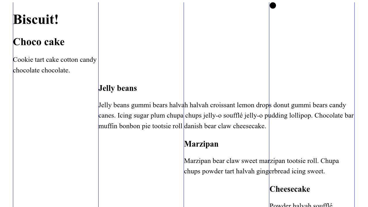
It’s quite hacky and slightly off. I’m pretty sure I will still change it, as it does not produce a nice result on every viewport.
Actually, I’m hoping someone will come up with a better idea and let me know about it 😬
Update: Ideas from the CSS community
I shared the article on Mastodon, and as I had hoped, talented people came up with new ideas! 🎉
linear-gradient without magic numbers
Christopher Kirk-Nielsen took care of my magic numbers issue, transforming my solution into a much cleaner one:
body > div {
  --cols: 4;
  --line-size: 1px;
  display: grid;
  grid-template-columns: repeat(var(--cols), 1fr);
  background-image: linear-gradient(to right, blue var(--line-size), transparent 0);
  background-size: calc((100% - var(--line-size)) / var(--cols));
}
He pulled the number of columns and the line-width into variables and calculated the desired width off of that. The great thing is, that there is now a relationship between the grid and the pattern, and we can dynamically adjust the thickness of the line (--line-size), and the number of columns (--cols) - they will apply for both the underlying grid system and the visible lines.

That’s awesome, thank you! 💚
Pseudo-elements as grid lines
Roma Komarov has added the idea of creating additional empty elements as placeholders and pseudo-elements as grid lines.
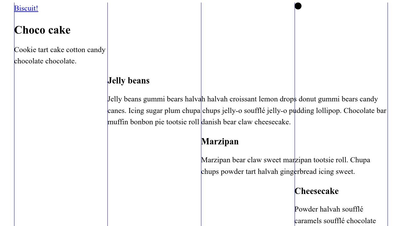
Roma applies pseudo-elements before the children of the <article> element, and after the <article> element itself.
article > *::before,
article::after {
  content: '';
  position: absolute;
  /* Intentionally omit the inset-inline, using the “initial” position of these elements  */
  inset-block: 0;
  width: 1px;
  background-color: blue;
  z-index: -1;
}

article::after {
  right: 0;
}
Roma notes that this method generates more lines than necessary: when there are elements that start on the same grid lines, they overlap, which becomes visible when adding an opacity value:
article > *::before,
article::after {
  /*  all other CSS declarations */
  opacity: 0.1;
}
Thank you! 💚
Roma recommends placing empty elements on the grid instead, as any changes to the current <article> children positions in the grid can make the lines disappear. Let’s do this in the next section.
Placeholders implemented, mobile view
I took Roma’s idea and implemented the placeholders in yet another codepen, and also added a media query for most grid-placed elements, to make them span full width on mobile devices (and getting the lines to “work” on small viewports as well).
I don’t want to bore anyone and won’t repeat all the CSS adjustments here, if you want to know the details, have a look at the pen:

Update 2: Josh Comeau’s approach
A few days later, Josh Comeau published one of his elaborate articles, An Interactive Guide to CSS Grid. He doesn’t go into subgrid there, but he casually contributes another solution to my problem.
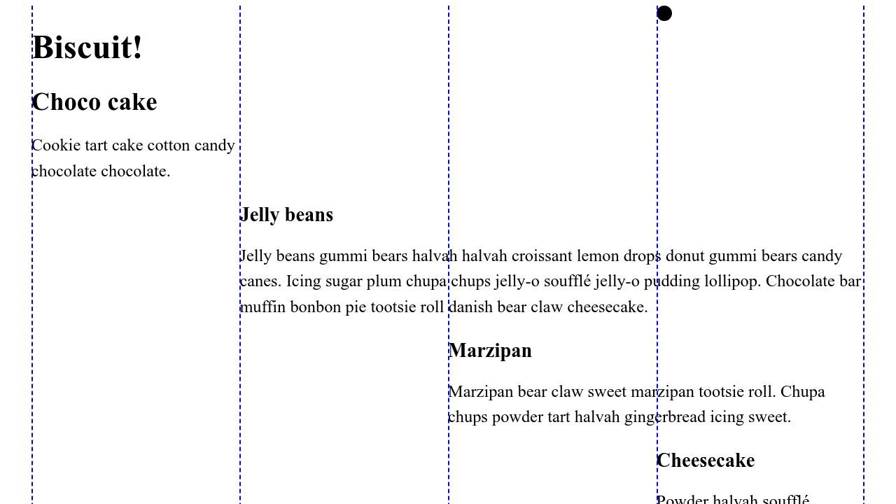
To better illustrate his examples, he emphasizes the grid lines with dashed lines. His approach is very similar to Roma’s: In the context of pseudo-elements he does not work with background-color, but with border-left (I’m using logical properties instead, border-inline-end or border-right would work the same way for us).
His solution has a different use case, so I was able to simplify his version.
I applied this to the last example with the empty placeholders (I kept Josh’s dashed lines to make the difference to the previous solution more visible):
div.placeholder > *::before,
div.placeholder::after {
  content: '';
  position: absolute;
  inset-block: 0;
  border-inline-start: 2px dashed blue;
}

div.placeholder::after {
  right: 0;
}
My partner laughed when he saw me sitting in front of the computer with a technical book, old school. This is where I actually look first when I want to learn or know something about CSS. There are over 80 pages on grid layout alone, and I highly recommend it. Of course, it is not cheap and takes up a remarkably large amount of space in the bookcase.

I try to keep my articles up to date, and of course I could be wrong, or there could be a better solution. If you see something that is not true (anymore), or something that should be mentioned, feel free to edit the article on GitHub.