"Inheriting" grid dimensions from siblings with subgrid
- Published:
- Reading time:
- 9 min.
Subgrids use the grid tracks of an ancestor grid to align their grid items. For example, you can create a number of columns on the <body> element and pass them “down”, no matter how deep. The gist here: the grid system that will be passed down must be on an ancestor. Subgrid searches up the DOM tree for the nearest element that defines a column or row template (grid-template columns or grid-template-rows) that is not marked as a subgrid.
So if I create a layout on the <body> element, I can transfer it to the landmarks <header>, <main> and <footer>, which will then effect their children.
Can the actual dimensions of the grid be defined by a sibling?
What I want to achieve is aligning siblings vertically: the dynamic dimensions of elements inside the <header> landmark shall implement the grid column template defined on the <body> element. The grid lines should “nestle” against the SVG logo and the site name next to it. Elements inside of <main> and <footer> should be able to participate in this grid, placing their own children alongside the dimensions of the logo and the site name.
Specifically, the H1 is to span the entire column, and I want the contents inside the <section> element and the paragraph in the <footer> to start at the height of the beginning site title. The <nav> in the <footer> should place itself just where the site title ends.
Grid and subgrid are not topics that are easy to understand at first. I therefore try to get to the result in detail and step by step.
The HTML looks like this:
<body class="wrapper flow">
  <header>
    <a class="logo" href="#">
      <svg
        viewBox="0 0 100 100"
        width="1em"
        height="1em"
        xmlns="http://www.w3.org/2000/svg"
      >
        <circle cx="50" cy="50" r="50" />
      </svg>
      <span>Marzipan</span>
    </a>
    <nav class="cluster" aria-label="Main">
      <ul class="cluster" role="list">
        <li>
          <a href="#">Cake</a>
        </li>
        <li>
          <a href="#">Ice cream</a>
        </li>
        <li>
          <a href="#">Candy</a>
        </li>
      </ul>
    </nav>
  </header>

  <main class="flow">
    <h1>Cupcake cake candy chupa chups tart marzipan chocolate bar</h1>
    <section>
      <p>
        Halvah shortbread topping muffin cookie gingerbread bear claw. Cheesecake oat cake
        caramels powder powder cookie jelly-o. Bonbon bonbon chupa chups chupa chups
        croissant. Dessert marshmallow sesame snaps liquorice jelly beans powder
        marshmallow cookie. Candy shortbread wafer chocolate bar chocolate tiramisu sesame
        snaps..
      </p>
      <p>
        Shortbread sesame snaps dragée brownie pastry bear claw soufflé. Tootsie roll cake
        sugar plum candy jelly beans biscuit. Macaroon chupa chups bonbon cookie macaroon.
        Croissant croissant jelly ice cream jelly-o tootsie roll shortbread chocolate bar.
      </p>
    </section>
  </main>

  <footer>
    <p class="copyright">© 2024</p>
    <nav aria-label="Complementary">
      <ul class="cluster" role="list">
        <li>
          <a href="#">Imprint</a>
        </li>
        <li>
          <a href="#">Privacy</a>
        </li>
      </ul>
    </nav>
  </footer>
</body>
The grid system
The grid system is defined for the <body> element. In the grid setup I create implicit grid areas with named lines, so I can easily reference them later:
body {
  display: grid;
  grid-template-columns:
    [full-start] min-content
    [logo-text-start] min-content
    [logo-text-end] 1fr
    [full-end];
  grid-template-rows:
    [header] auto
    [main] 1fr
    [footer] auto;
}
The grid-template-columns and grid-template-rows properties create explicit grid tracks: the grid columns should wrap tightly around the SVG logo and then align with the site title. min-content does that for us: it represents the intrinsic minimum width of the content.
This grid track will become just as small as the widest content element that places itself in this column. We must therefore ensure that only the SVG and the site title do this.
The remaining available space is reserved for the menu, the fr unit makes sure of that.
The explicit rows specify that the <header> and <footer> should have a height determined by their content, while <main> should take up the remaining space. This places the <footer> at the bottom of the viewport. To prevent the elements in <main> from splitting up weirdly when there is little content, I also set the rule main {place-content: start;}.
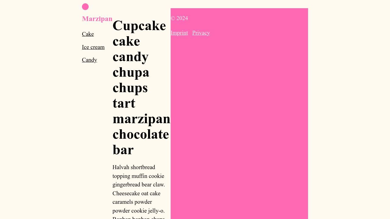
Without subgrid, the landmarks now jam themselves in the tracks given to them.

We can counteract this by having them take up the entire column width:
body > * {
  grid-column: 1/-1;
}
But, instead of using the notation 1/-1 for the entire width, we can also use our name mechanism.
The named lines full-start and full-end created a named area, which I can now reference as full:
body > * {
  grid-column: full;
}
The grid-template columns set in the <body> element shall now be adopted by the three children of the <body>.
body > * {
  grid-column: full;
  display: grid;
  grid-template-columns: subgrid;
}
It is no longer the landmarks themselves that are placed in the grid, but their children, as if the grid column blueprint were defined in the landmarks themselves. It is not just a copy of the value, the three elements literally use the grid tracks of the <body>.
Now the children of the three landmarks determine the dimensions of the grid, but it is the wrong element that defines the width: according to min-content, the longest word of the Heading element inside of <main> now defines the dimensions of the first grid area.
All three landmarks have only two children, so the third column is empty.

Let us first free the children of the <main> element from the task of determining the grid dimensions. We want them to span the entire available width of the wrapper, which in our case only affects the H1, because everything in the <section> element should be aligned where the site title begins.
main > * {
  grid-column: full;
}

main > section {
  grid-column: logo-text-start / full-end;
}
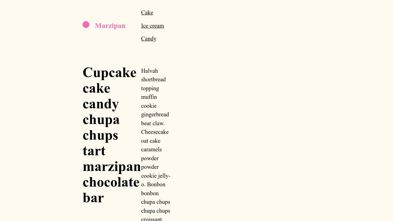
Almost!
We are missing one last step, namely .logo with its two children must also inherit the blueprint grid columns.
However, it should extend from full-start to logo-text-end.
.logo {
  grid-column: full-start / logo-text-end;
  display: grid;
  grid-template-columns: subgrid;
}
We skipped several levels, so to speak, until we finally allowed the children of .logo to define the dimensions that we can now pass on to the siblings of <header> and their children.
Final grid placements
I set a breakpoint for the <nav> element in the <header>, so that it is aligned with the site name on the second line for small viewports, and it takes up the area from the end of the site name to the end of the wrapper on wider displays:
header > nav {
  grid-column: logo-text-start / full-end;
}

@media (min-width: 30em) {
  header > nav {
    grid-column: logo-text-end / full-end;
  }
}
Finally, the paragraph in the <footer> should span the width of the site name. We achieve this with another named area: logo-text.
This makes the following <nav> take up the remaining space:
footer > p {
  grid-column: logo-text;
}
Now we have a layout in which the grid is defined on the <body>, but is only really implemented by the children of the <header>.
Remarks
Further down in the CSS you will find all the small settings I have otherwise made, the classes .cluster and .flow originate from the layout primitives of every-layout.dev, the fluid type and space scales were calculated with the help of utopia.fyi.
Cathy Dutton came up with the idea of using a flexible parent grid column for vertical alignment under siblings back in 2020 in an article published on css-tricks.com.
Thanks to Bob Monsour’s reference to Ryan Mulligan’s article “Horizontal Scrolling in a Centered Max-Width Container”, I came across an article by Anna Monus that explains the differences between subgrids and nested grids (grid-template-columns: subgrid; and grid-template-columns: inherit;).
This is also well worth reading in this context.
I try to keep my articles up to date, and of course I could be wrong, or there could be a better solution. If you see something that is not true (anymore), or something that should be mentioned, feel free to edit the article on GitHub.